

Typography in Design: Much More Than Choosing a Pretty Font
- Estudio CKS

- Aug 20, 2025
- 3 min read
Updated: Sep 4, 2025

When we think about digital design, the first things that usually come to mind are colors, images, or the layout of a website. However, there’s an element present in almost every brand touchpoint that often doesn’t get the attention it deserves: typography.
The way text is presented has a direct impact on how your content is perceived, how easy it is to understand, and what kind of feeling it conveys. Choosing a typeface isn’t just an aesthetic decision: it’s a strategic one.

Typography and User Experience: Is Your Message Clear?
The first criterion for typography is the most obvious one—though not always followed—legibility. And this goes beyond the typeface itself. It also involves size, line height (leading), contrast with the background, and the visual hierarchy being built.
Size
The most common recommendation for base text on the web is 16px to 18px, depending on the font and the device. Larger screens may require slightly bigger sizes. What matters most is testing in real context and ensuring comfortable reading.

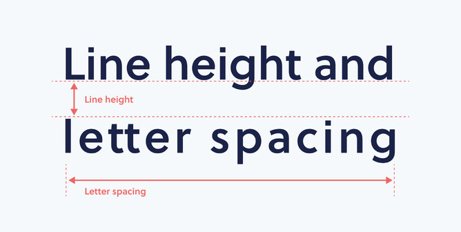
Line Height
A good line height makes it easier for the eye to follow the text. The general rule is 120% to 150% of the font size. For example, if you use a 16px font, line spacing should be between 19px and 24px.
Visual hierarchy
Headings, subheadings, highlighted text, and body copy all need to be clearly differentiated, but in a coherent way. Hierarchy isn’t only built with size—it also comes from weight (light, bold), style (regular, italic), color, or even letter spacing.
It’s not necessary to use many fonts. One font family with multiple variants (regular, medium, bold, italic) can create a strong, coherent, and visually appealing hierarchy.
Your Brand’s Tone Is Also Read
Typography also reflects your brand personality. Some fonts feel serious and corporate, others more fresh and friendly, while others convey innovation, tradition, or closeness. None is inherently better: what matters is that it supports your message and feels aligned with your visual universe.

A site selling technology shouldn’t look the same as one about emotional well-being. What emotions do you want to evoke? From what perspective do you want people to read you? A typeface can whisper, shout, or simply converse. Choose the one that says what you need it to say.
Accessibility: A Criterion That Shouldn’t Be Overlooked
When we design, we must also think about who is reading us. Using accessible fonts (clear, well-spaced, with enough contrast) allows people with different visual conditions or neurodiversities to better navigate and understand content.

This doesn’t just improve usability—it’s also an ethical and responsible practice.
For example, Wix Studio lets you adjust font size, line height, and spacing across breakpoints, making it easier to optimize for multiple devices without sacrificing accessibility or design.
Typography in Action: Usability, Aesthetics, and Coherence
Typography should feel natural. If something is hard to read, uncomfortable on the eyes, or looks messy, something likely needs adjusting. A simple rule we often propose for projects is:
Use a single font family with several variants (e.g., a sans serif with regular, medium, and bold)
Define 3 hierarchy levels: title, subtitle, body
Adjust spacing and line height so the text can breathe
Test across devices before final approval

Typography design is not a minor detail. It’s part of the tone, the message, the user experience, and the identity-building process of a brand.
At Estudio CKS, we believe good typography use not only improves a site’s aesthetics but also enhances its ability to connect with people. Because reading, in the end, is also a way of listening.


